Soybeans are Exciting
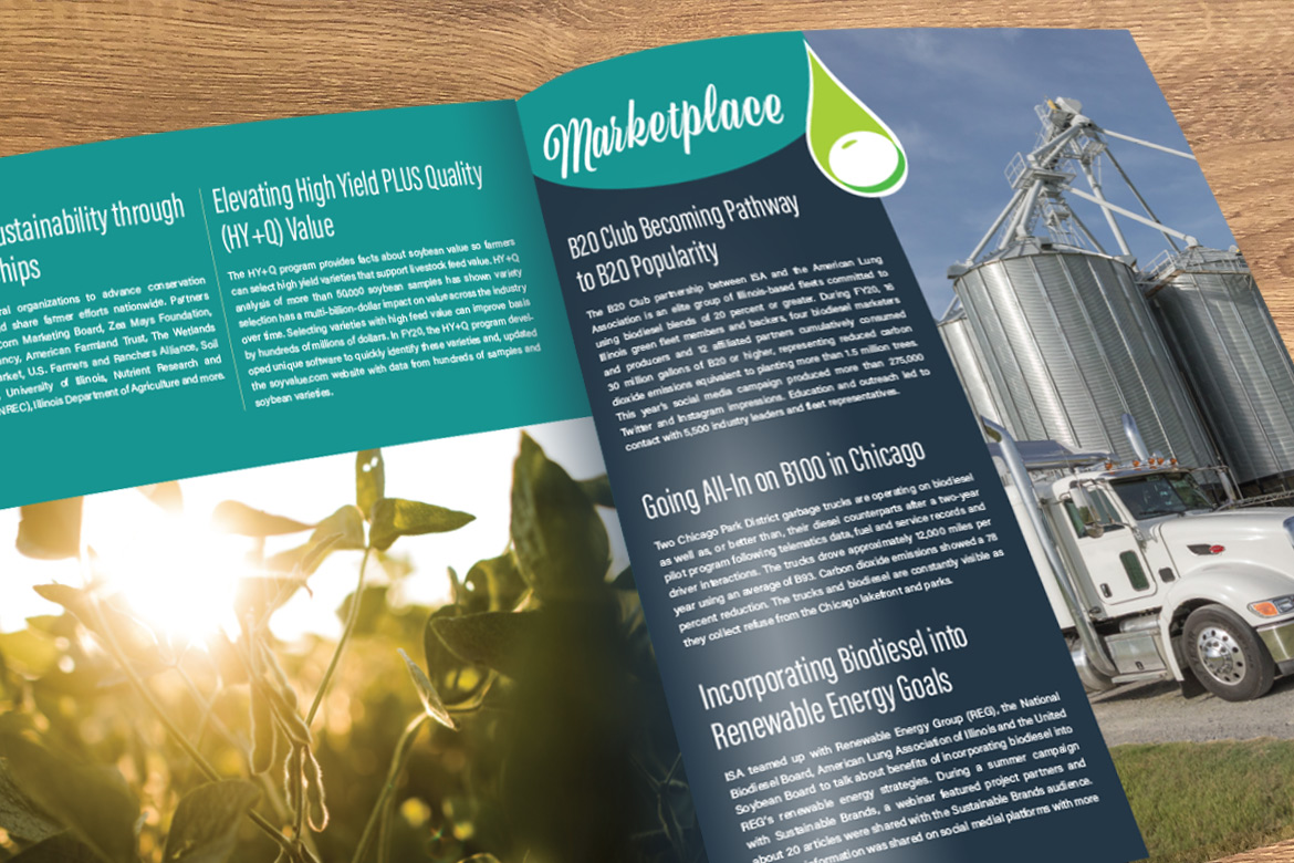
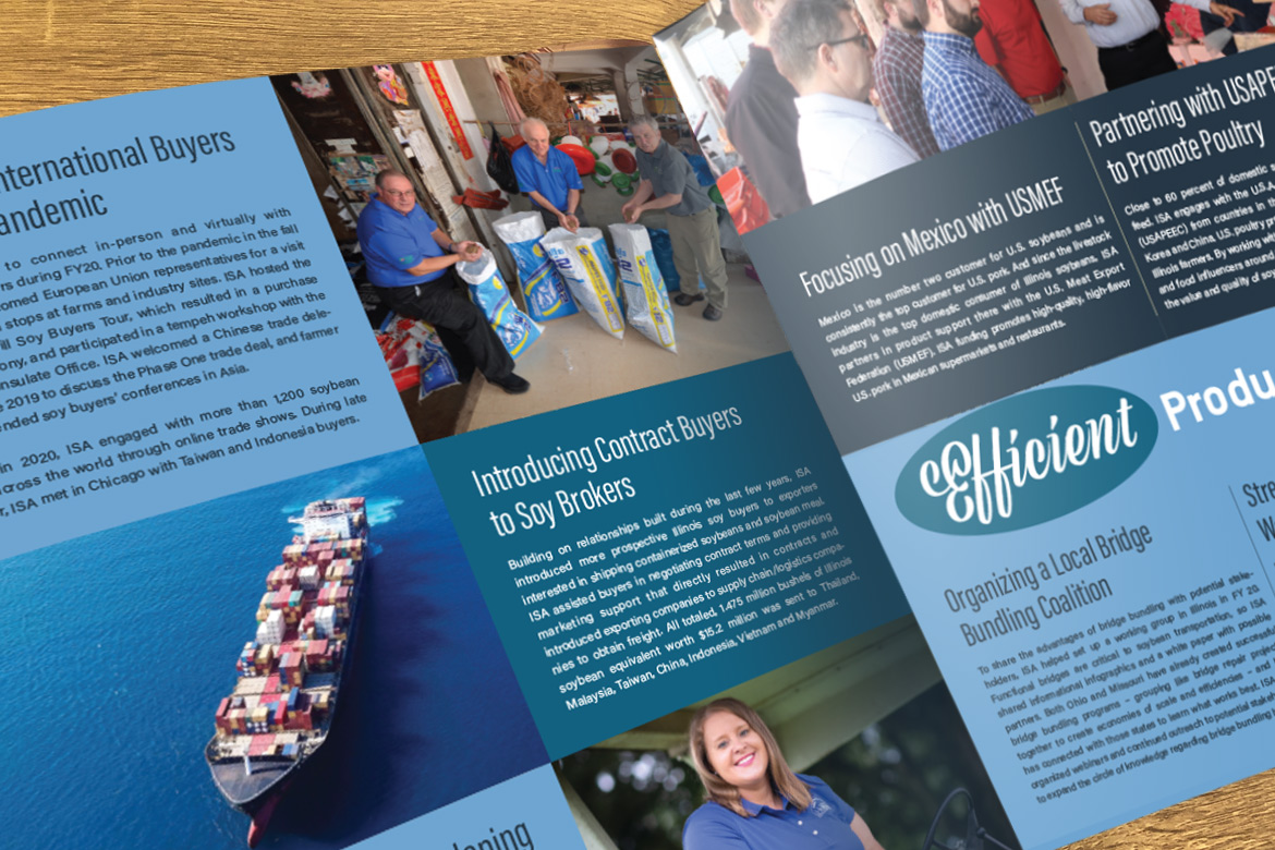
Yes, we really mean that! Illinois is one of the top soybean producing states and our state has some of the most exciting soybean developments in the country. When Illinois Soybean Association asked us to design their annual report, we worked closely with them to highlight their most important programs, such as biodiesel, by bringing in the brand elements from the major initiatives, using bold photography, and broad splashes of color to break up the text.

The right imagery was crucial for this piece; we wanted a good combination of the star of the show (soybeans!) as well as representing the people and transportation of the industry.

Bright colors from their brand guide combined with their corporate font Acumin, and the display font Viktor Script, which tied closely to the subtly retro-futuristic feeling of the brand.
Annual reports always make us ask the question “how can we make this more like the brand?” It’s not enough just to make something attractive; we want it to feel as close to the brand as possible, taking the extra time to truly consider how to tie in the various assets into something that feels cohesive and fun to read.


