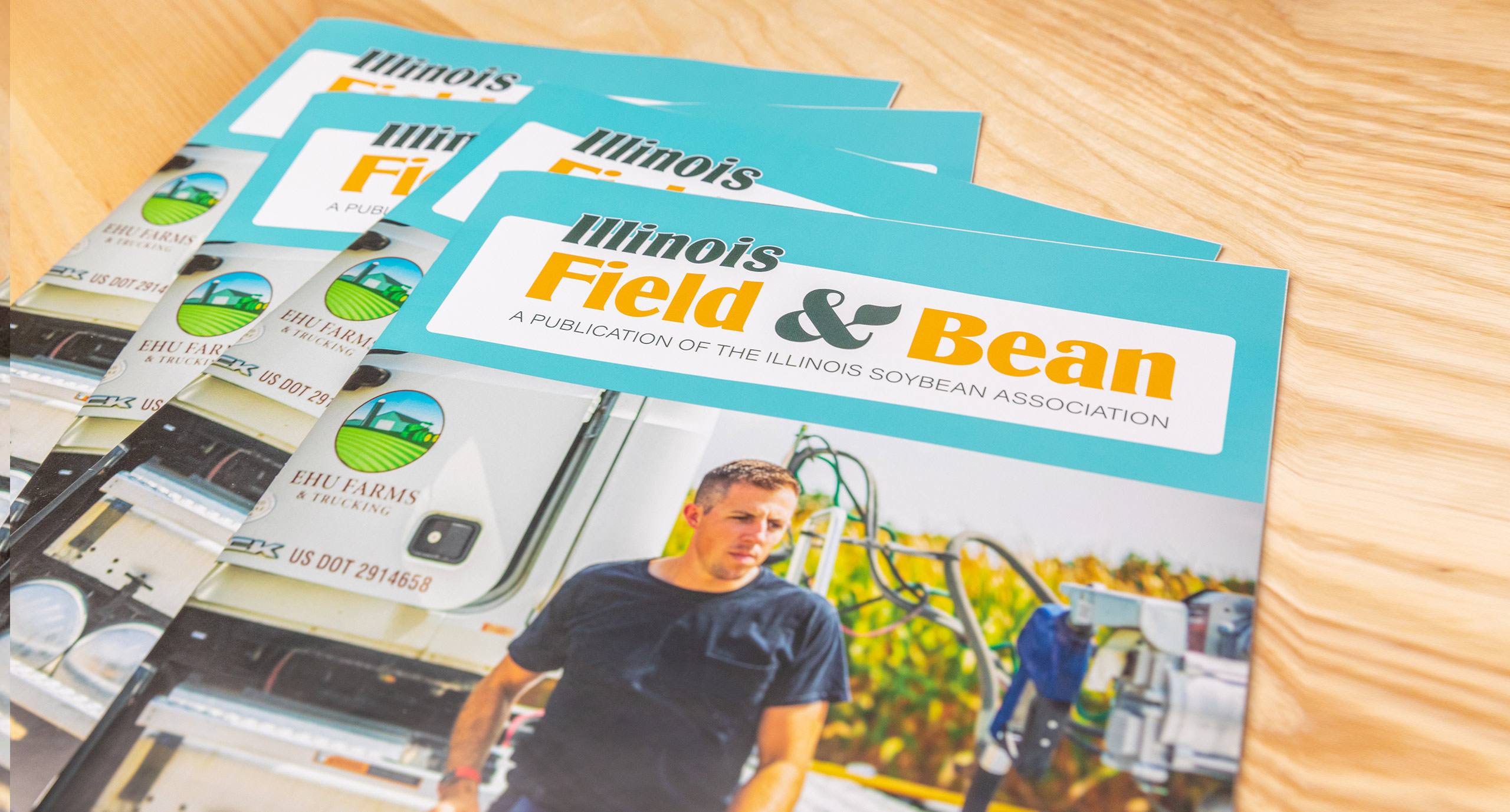
Connecting with Farmers and the Pride of Soybeans in Illinois
When the Illinois Soybean Association decided to go back to the roots of their original Illinois Field & Bean masthead name, we had one advantage; not many marketing firms have an archive of agricultural publications going back to the 1920s. Looking through the history of farming magazines and advertisements gave us the inspiration for the retro-cool refreshed brand design. Our goal was to foster pride in Illinois soybean farming and a feeling of connection to the 43,000 Illinois soybean farmers who receive and read Illinois Field & Bean. Sampling styles from vintage Prairie Farmer and Successful Farming, we were inspired by the robust fonts and distinctive design elements of the 40s and 50s.
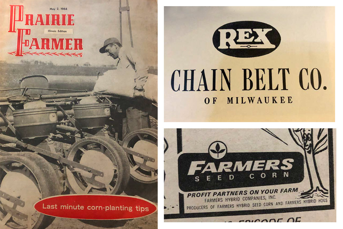
Connecting with Farmers
We developed a full brand guide for the publication with an eye to the rich history of agriculture, while keeping farmers up to date on the latest initiatives from the Illinois Soybean Association. This honors the past and current accomplishments of ISA, and gives plenty of opportunity and flexibility for the future.
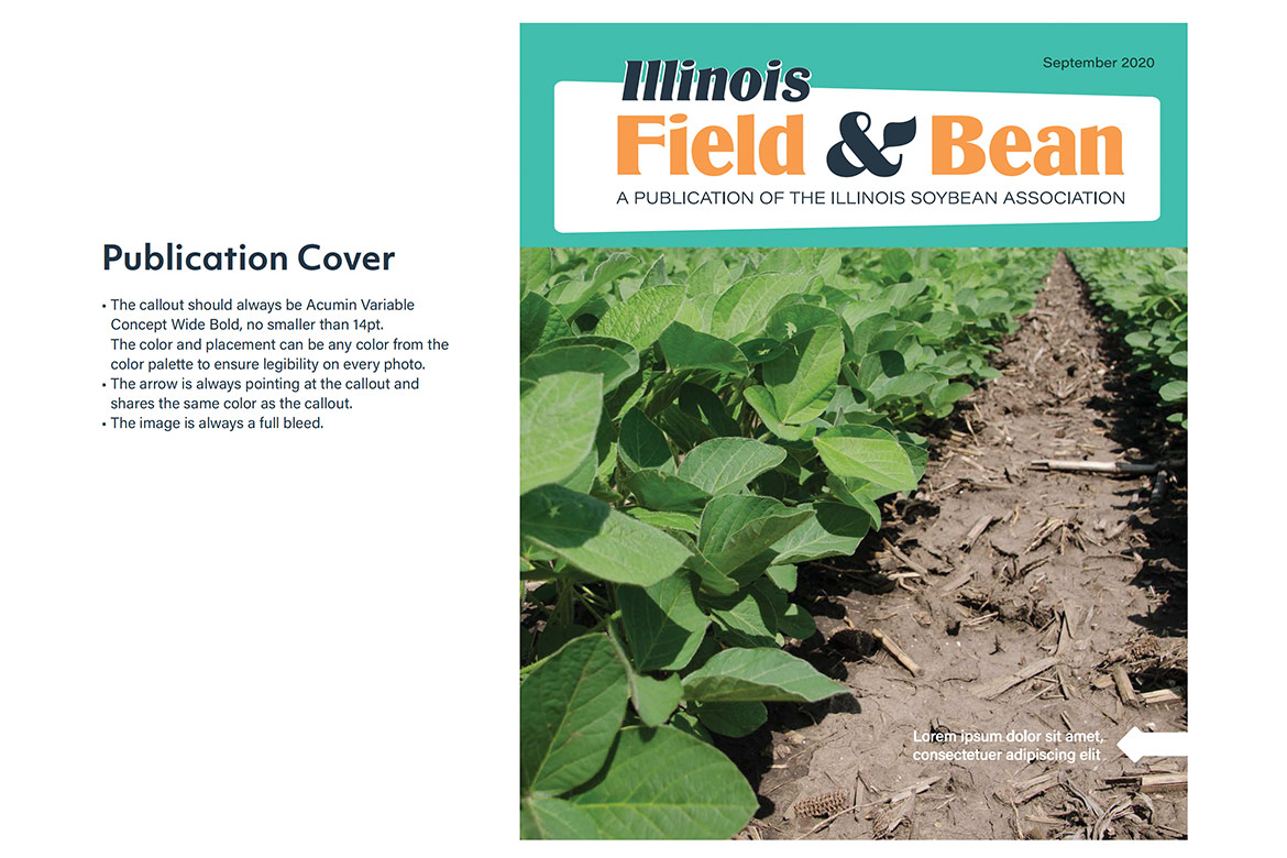
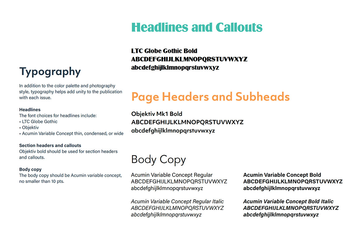
Typography ties closely into the overall Illinois Soybean Association brand, utilizing the main fonts for the organization, while adding the new element of Globe Gothic Bold to allow the magazine to have its own unique identity.
The publication has been well received so far, with farmers excited to “go back to their roots” while looking forward to new advances in soybeans.
