Growing into a new brand
Branding
Photography
Print material
Edgewood Clinical Services offers premier mental health counseling in the Chicagoland area. Their five locations had outgrown the existing brand, and, with major additional expansion on the horizon, they needed help shepherding their brand into a new phase of growth.
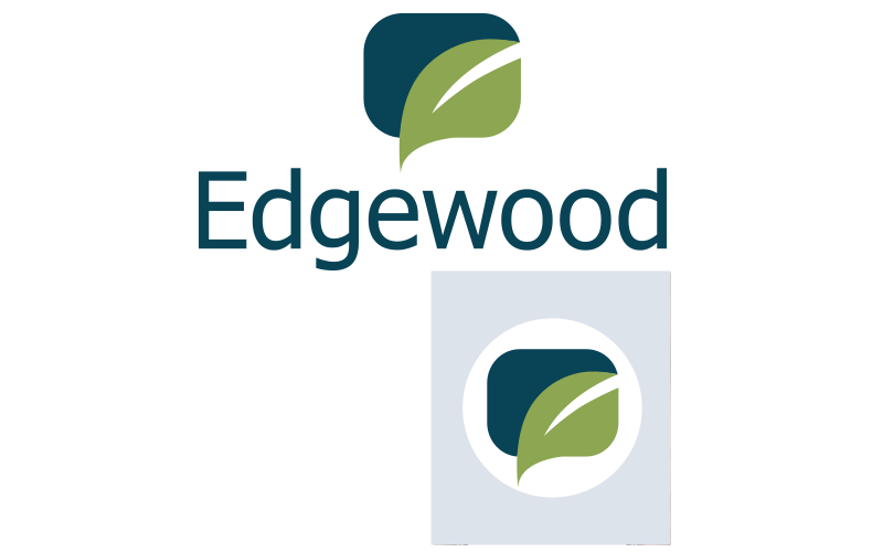
The brand of Edgewood
The new logo was developed to feature the organization as innovative and bold. The green leaf ties to the heritage of the brand – and has been integrated into a conversation bubble to represent healthy communication.

The logo is particularly versatile with a talk bubble icon that easily resizes to stand alone as an icon for web and social media applications.
As both a call to action and an answer to a problem, the tagline “Let’s Start Talking” is a positive and friendly affirmation that healthy conversation is the first step toward a healthy mind, body, and spirit.

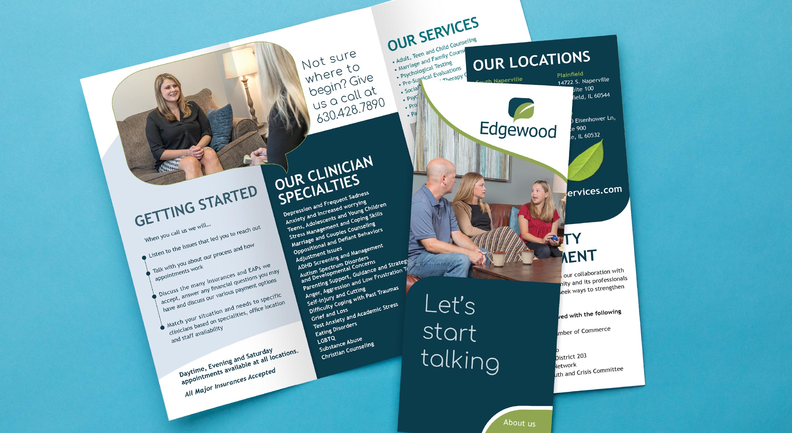
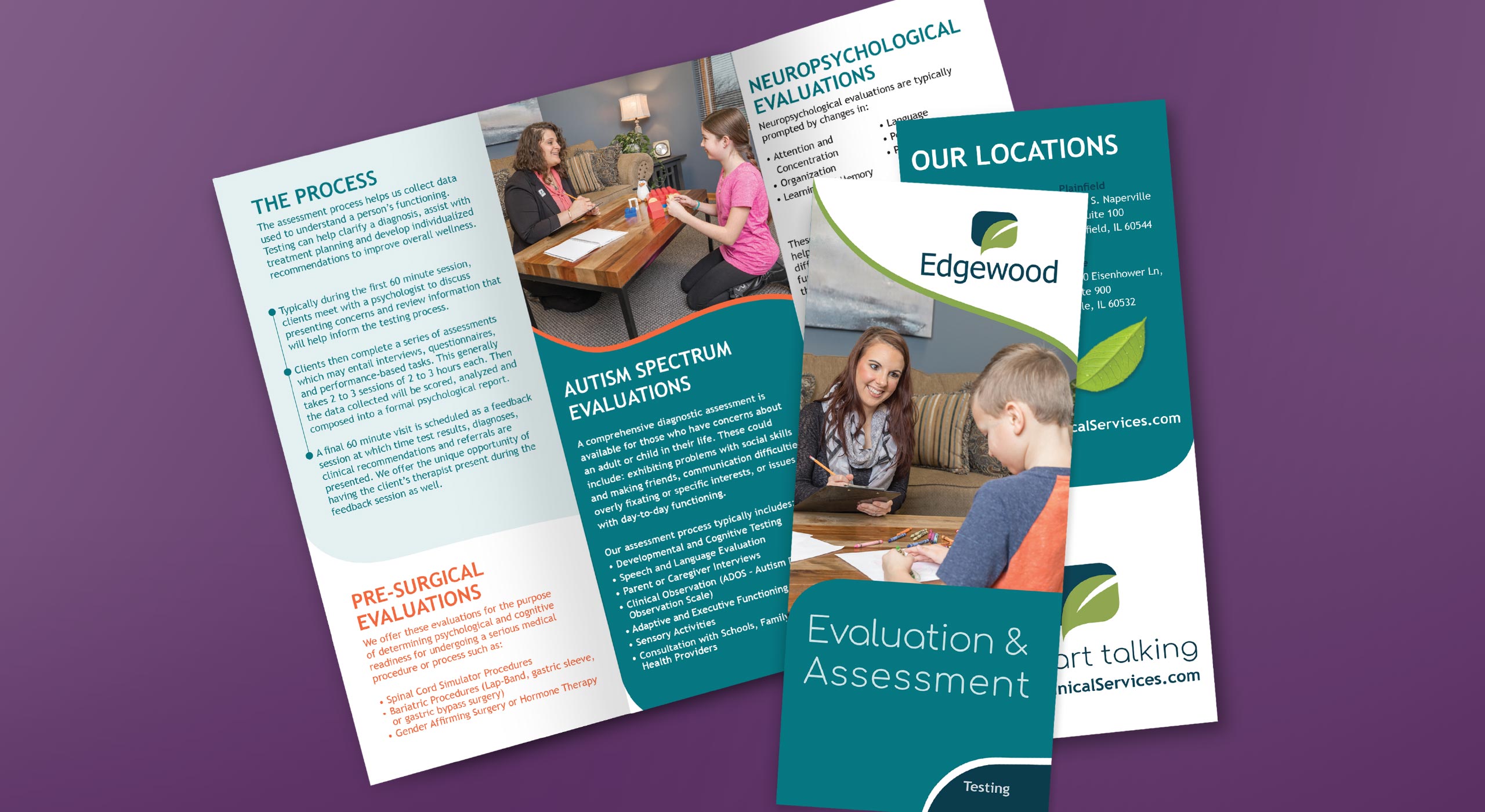
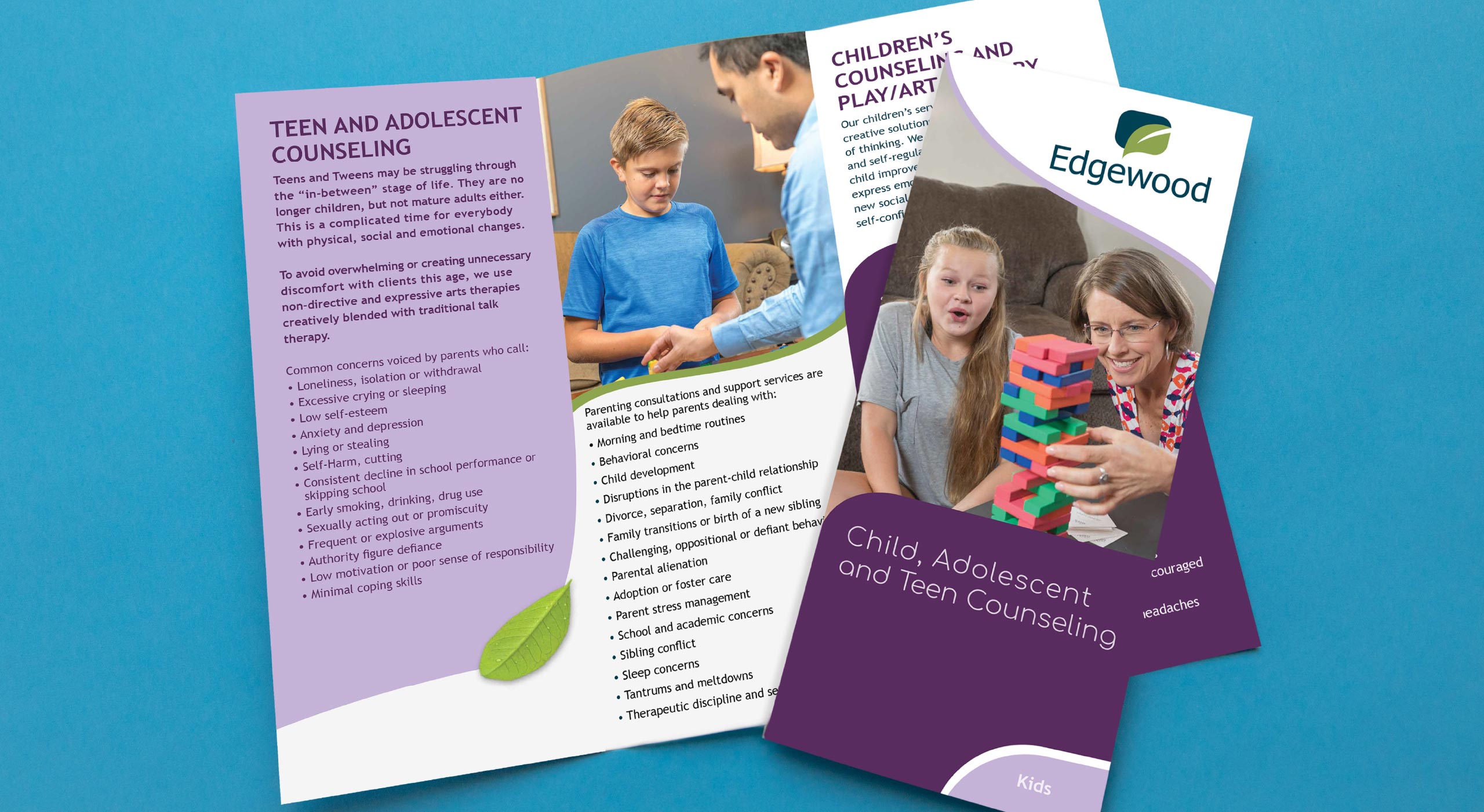
Print materials for Edgewood are clear and friendly, tailored to their various audiences. Pediatric services are called out in purple, both in print and digital material, for a quick visual cue that anything purple is kid related. Talk bubbles filled with images of real people we photographed at Edgewood’s offices bring a strong brand identity to their materials.
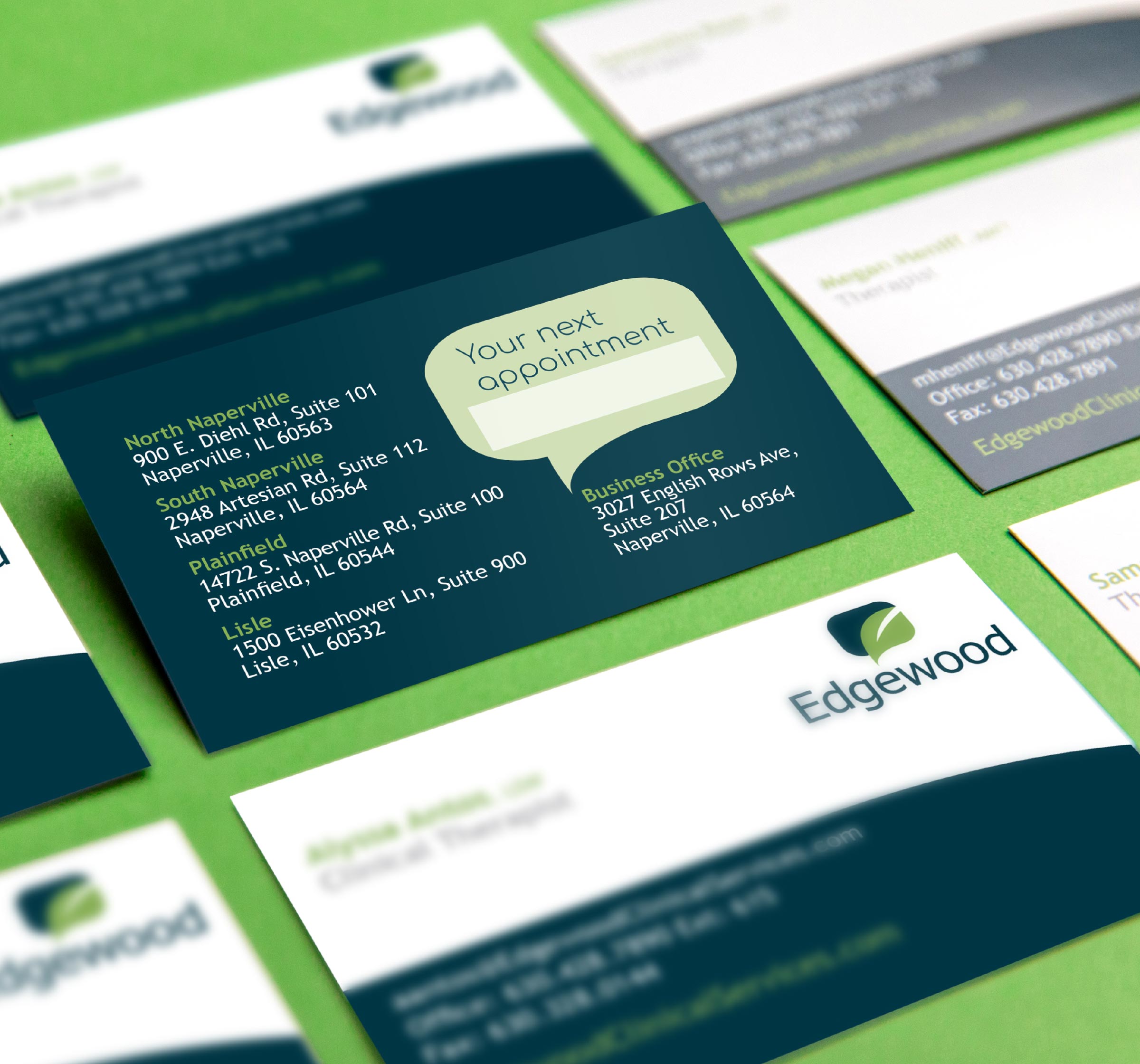
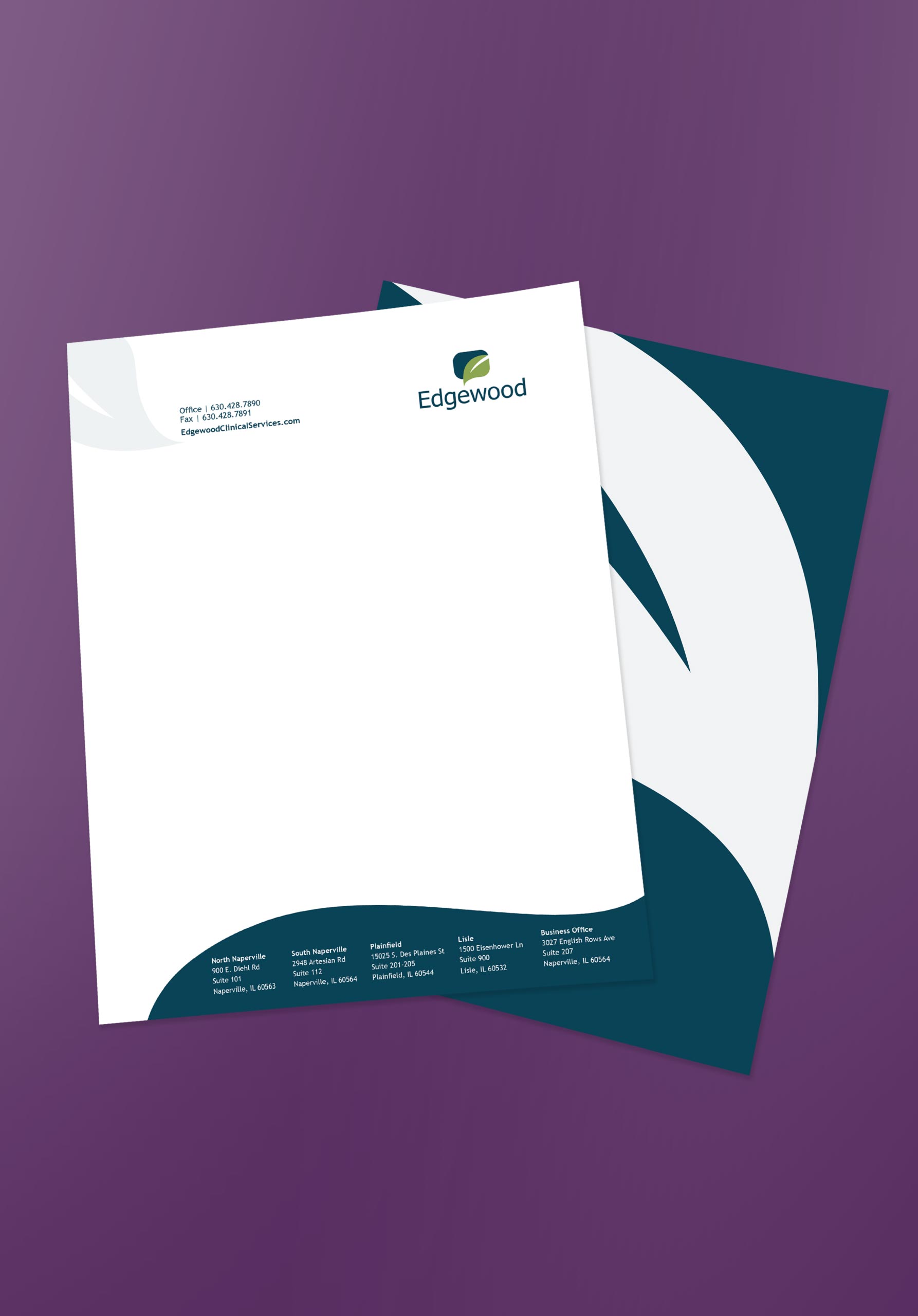
Business cards and letterhead had to be practical and easy to amend; the employee roster is large and ever growing. The back side of the cards also serves as an appointment reminder.
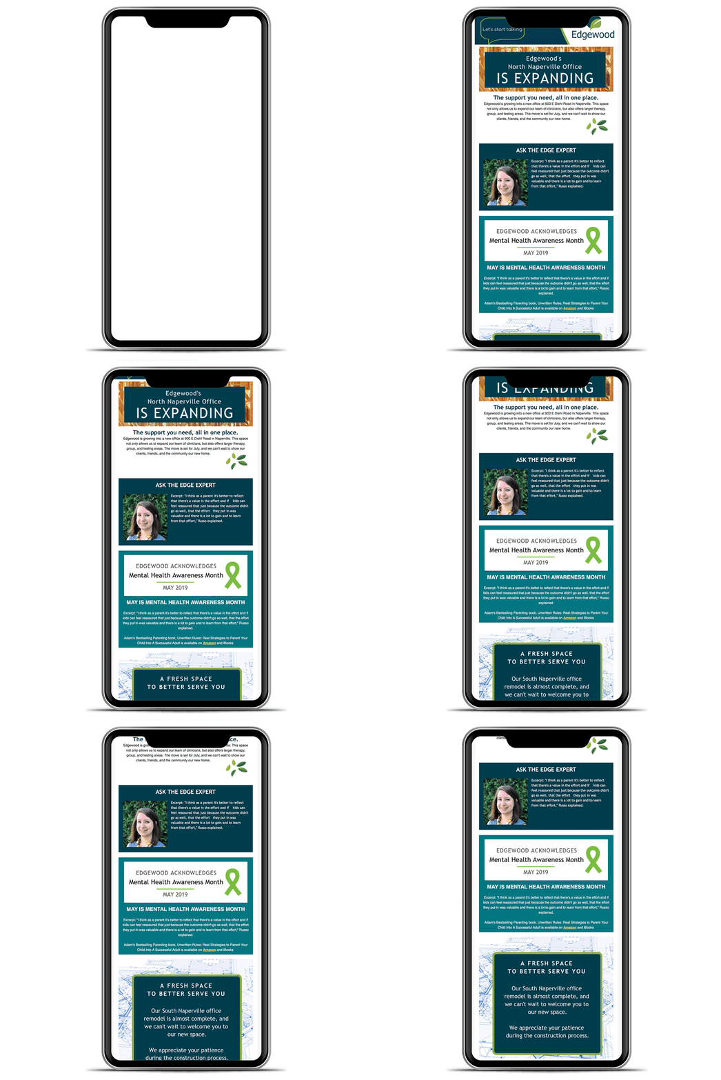
Our strategy for Edgewood messaging was to mainstream mental health awareness. Many people are overwhelmed when encountering the mental health system for the first time. The messaging acknowledged how overwhelming that can feel, provided steps in what to expect in the process, and did it all while keeping a friendly and approachable tone.
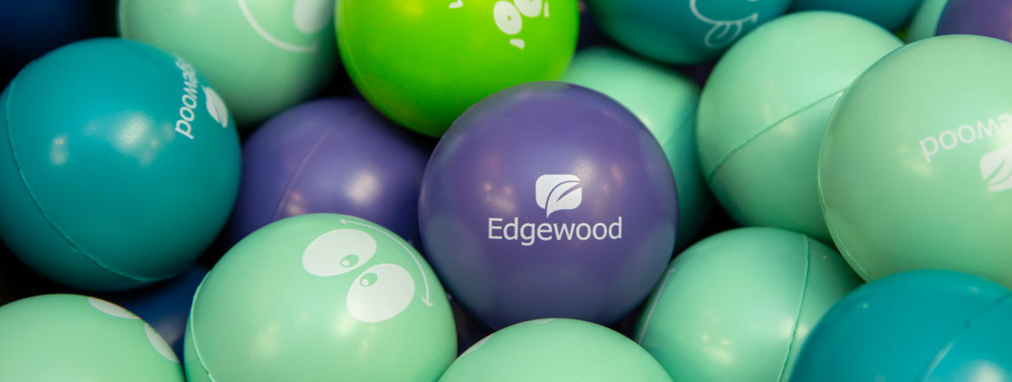
We used bright colors – not usually associated with metal health practices to both help Edgewood stand out from the crowd – and project a friendly and approachable feel.
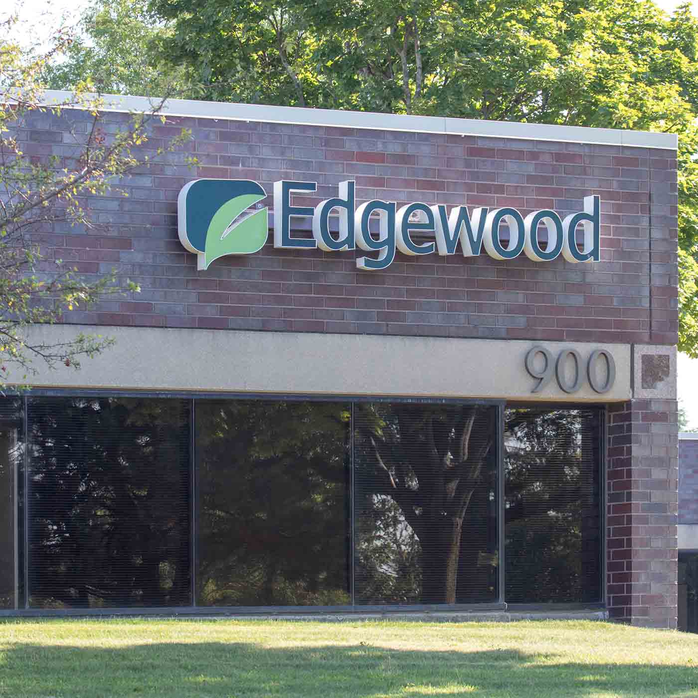
Bold exterior lighted signs were needed at each of the Edgewood clinics. We worked with the sign company to assure consistency regardless of the signage size or location.
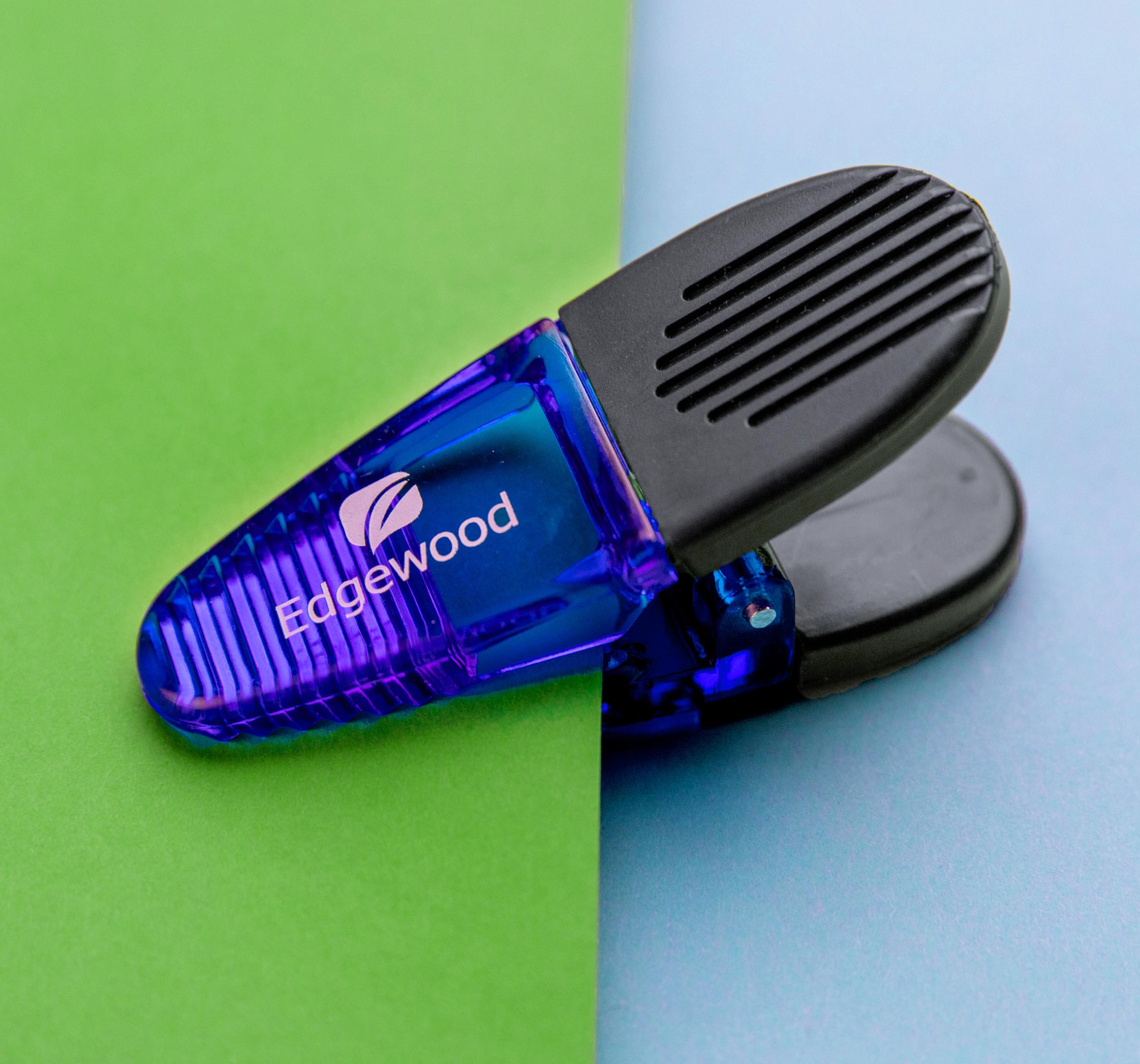
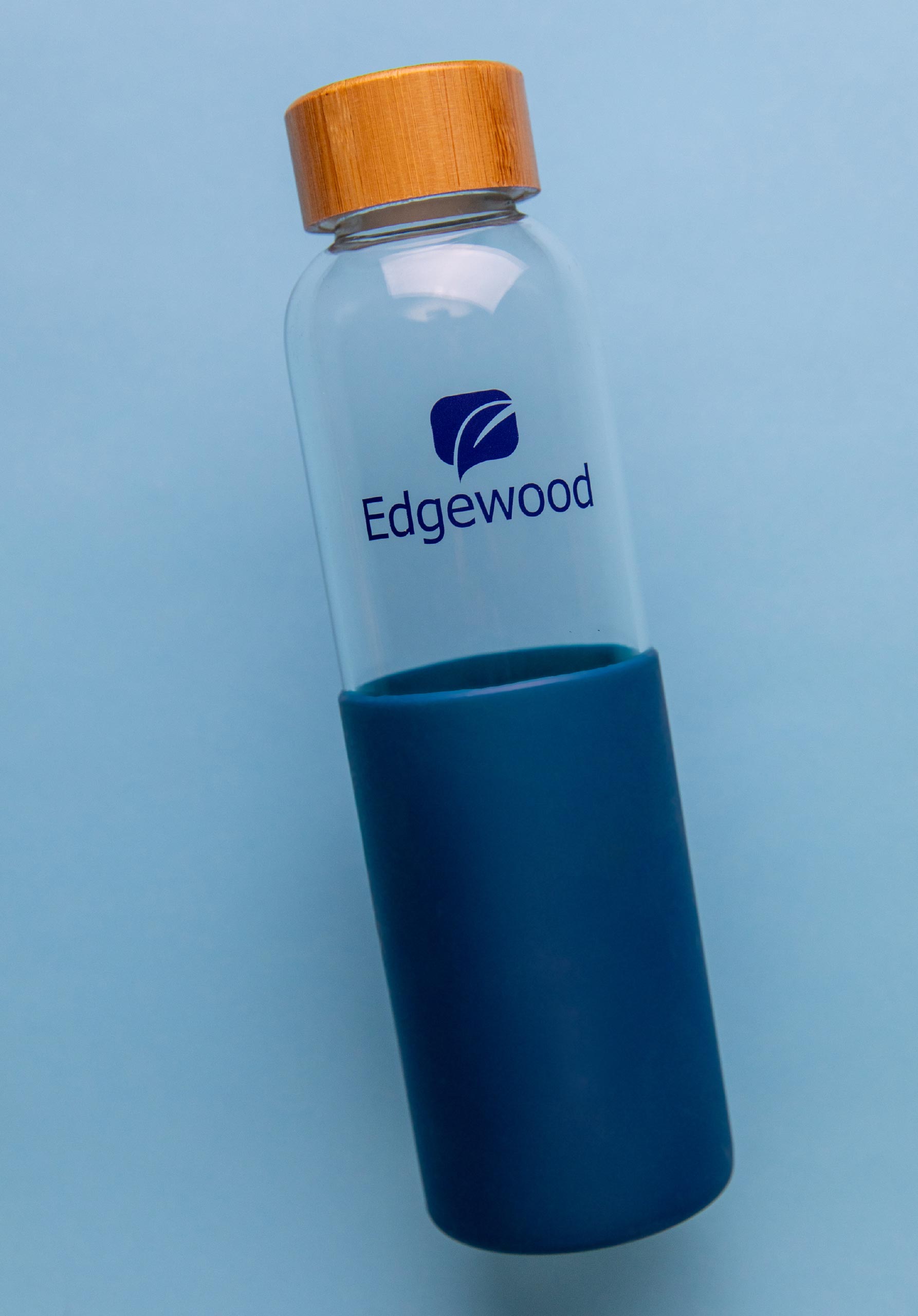
The Edgewood logo was designed to reproduce easily in one color and works well for a variety of uses, including silkscreen and embroidery.
