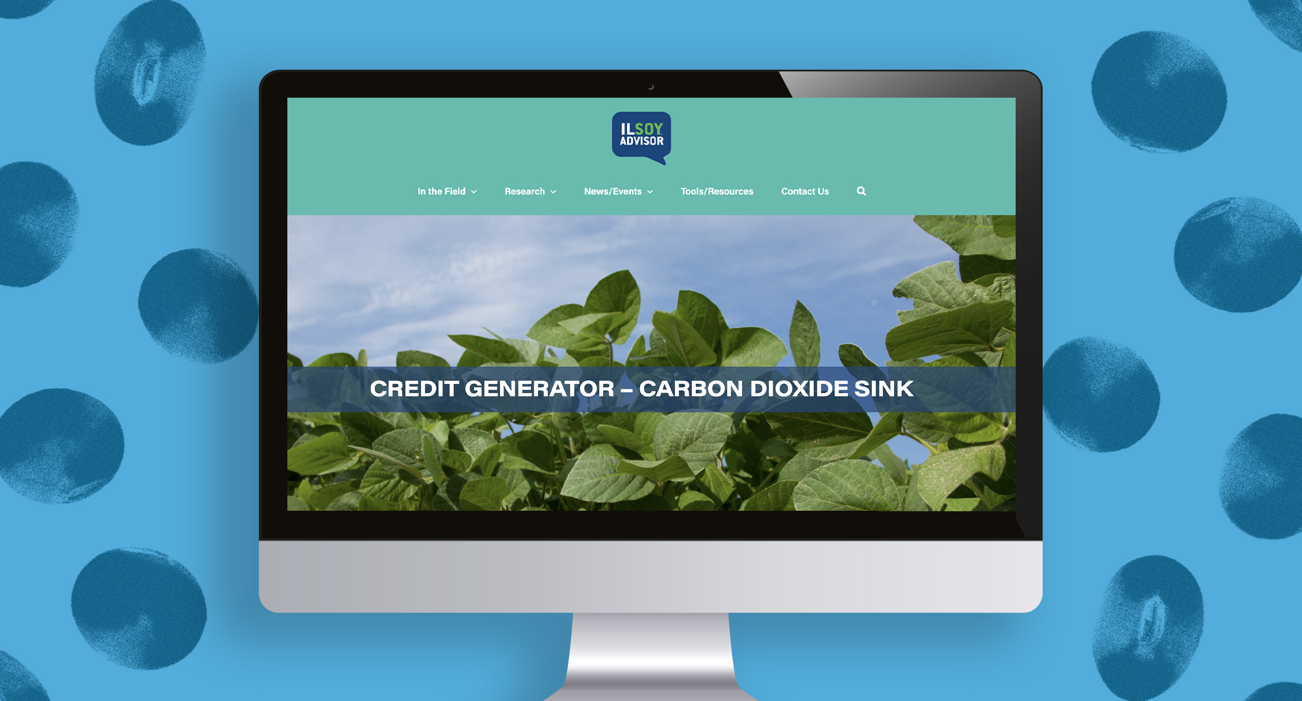
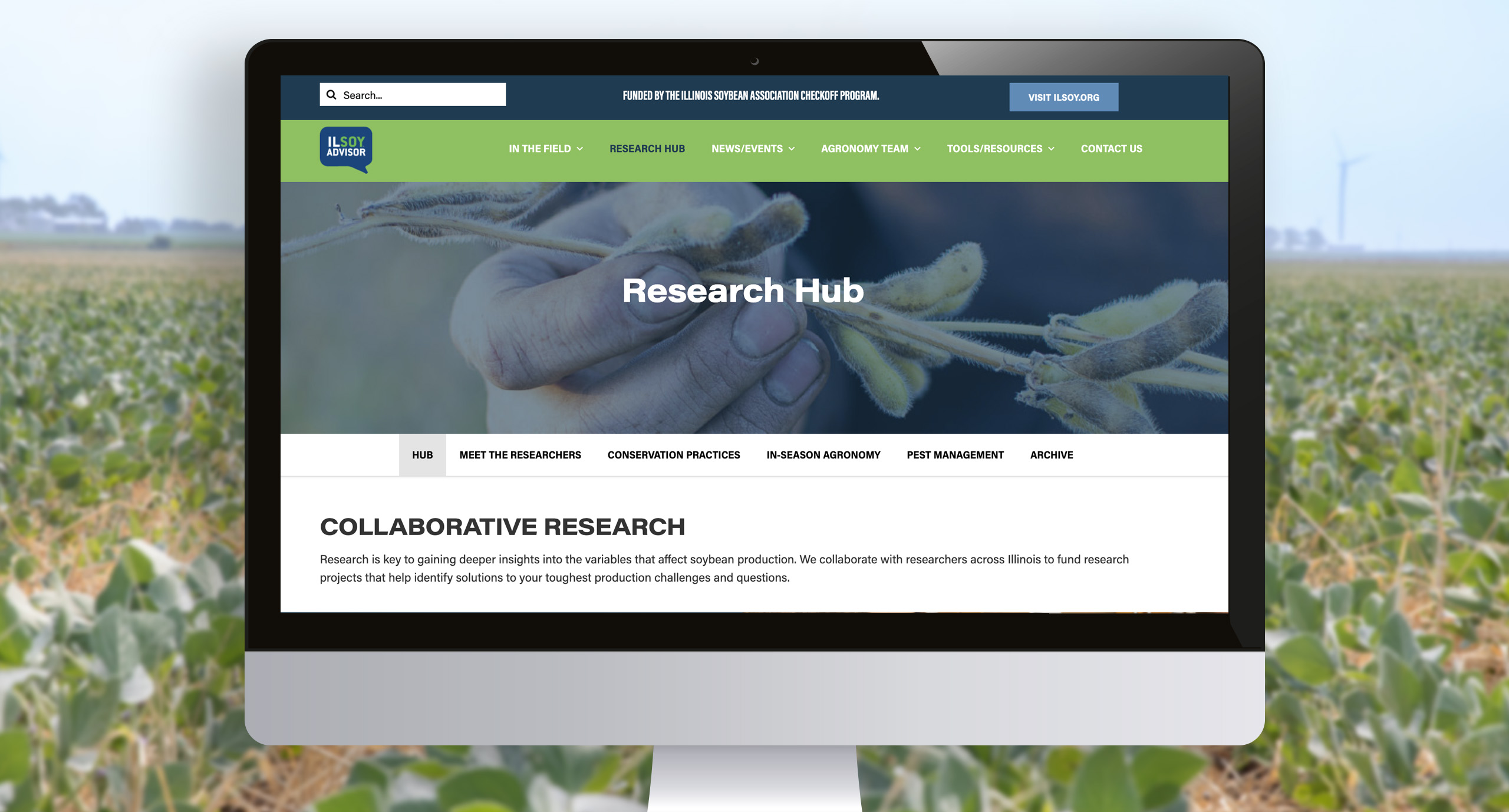
Understanding carbon markets is no easy task!
You may have heard about carbon capture, but there’s also carbon offset markets, inset markets, and credit aggregators. It can get confusing pretty quickly. IlSoyAdvisor came to us with a request to create a carbon infographic website scroll that made carbon markets less onerous.
This infographic needed to illustrate how the farmer engages through the carbon market ecosystem and the various pathways they could take. With the farmer having multiple options to sell their grain, it was our job to present the information in a clear and visually appealing way.
How do you make something complicated easier to understand? Let’s break it down!
- We started by incorporating a color coding system to visually signal the difference between types of carbon markets, such as inset versus offset markets.
- Custom illustrated icons and motion graphics helped tell the story for each section.
- The information is presented in bite sized chunks within the website, making it seem shorter and less intimidating to read through.

And that’s what good design really should be! Utilizing the tools of color, shape, and placement to help tell someone a story in a way that is easy for them to understand.
Have a new product or system you aren’t quite sure how to roll out? Get in touch today!


